Design Principles
Core principles that guide HeroUI v3's design and development
HeroUI v3 follows 10 core principles that prioritize clarity, accessibility, customization, and developer experience.
Core Principles
1. Semantic Intent Over Visual Style
Use semantic naming (primary, secondary, tertiary) instead of visual descriptions (solid, flat, bordered). Inspired by Uber's Base design system, variants follow a clear hierarchy:

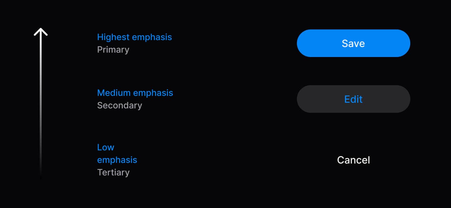
// ✅ Semantic variants communicate hierarchy
<Button variant="primary">Save</Button>
<Button variant="secondary">Edit</Button>
<Button variant="tertiary">Cancel</Button>| Variant | Purpose | Usage |
|---|---|---|
| Primary | Main action to move forward | 1 per context |
| Secondary | Alternative actions | Multiple allowed |
| Tertiary | Dismissive actions (cancel, skip) | Sparingly |
| Danger | Destructive actions | When needed |
2. Accessibility as Foundation
Built on React Aria Components for WCAG 2.1 AA compliance. Automatic ARIA attributes, keyboard navigation, and screen reader support included.
import { Tabs, TabList, Tab, TabPanel } from '@heroui/react';

<Tabs defaultSelectedKey="profile">
  <TabList aria-label="Settings">
    <Tab id="profile">Profile</Tab>
    <Tab id="security">Security</Tab>
  </TabList>
  <TabPanel id="profile">Content</TabPanel>
  <TabPanel id="security">Content</TabPanel>
</Tabs>
3. Composition Over Configuration
Compound components let you rearrange, customize, or omit parts as needed. Use dot notation, named exports, or mix both.
// Compose parts to build exactly what you need
import {
  Accordion,
  AccordionItem,
  AccordionHeading,
  AccordionTrigger,
  AccordionIndicator,
  AccordionPanel,
  AccordionBody
} from '@heroui/react';

<Accordion>
  <AccordionItem id="1">
    <AccordionHeading>
      <AccordionTrigger>
        Question Text
        <AccordionIndicator />
      </AccordionTrigger>
    </AccordionHeading>
    <AccordionPanel>
      <AccordionBody>Answer content</AccordionBody>
    </AccordionPanel>
  </AccordionItem>
</Accordion>
4. Progressive Disclosure
Start simple, add complexity only when needed. Components work with minimal props and scale up as requirements grow.
// Level 1: Minimal
<Button>Click me</Button>

// Level 2: Enhanced
<Button variant="primary" size="lg">
  <Icon icon="gravity-ui:check" className="mr-2" />
  Submit
</Button>

// Level 3: Advanced
<Button variant="primary" isDisabled={isLoading}>
  {isLoading ? <><Spinner size="sm" className="mr-2" /> Loading...</> : 'Submit'}
</Button>
5. Predictable Behavior
Consistent patterns across all components: sizes (sm, md, lg), variants, className support, and data attributes. Same API, same behavior.
// All components follow the same patterns
<Button size="lg" variant="primary" className="custom" data-pressed="true" />
<Chip size="lg" variant="success" className="custom" />
<Avatar size="lg" className="custom" />

// Compound components support both named exports and dot notation
import { Alert, AlertIcon, CardHeader, AccordionTrigger } from '@heroui/react';

// Named exports
<Alert>
  <AlertIcon />
</Alert>

// Dot notation
<Alert>
  <Alert.Icon />
</Alert>
6. Type Safety First
Full TypeScript support with IntelliSense, auto-completion, and compile-time error detection. Extend types for custom components.
import type { ButtonProps } from '@heroui/react';

// Type-safe props and event handlers
<Button
  variant="primary"  // Autocomplete: primary | secondary | tertiary | danger | ghost
  size="md"          // Type checked: sm | md | lg
  onPress={(e) => {  // e is properly typed as PressEvent
    console.log(e.target);
  }}
/>

// Extend types for custom components
interface CustomButtonProps extends Omit<ButtonProps, 'variant'> {
  intent: 'save' | 'cancel' | 'delete';
}
7. Separation of Styles and Logic
Styles (@heroui/styles) are separate from logic (@heroui/react), enabling use with any framework or vanilla HTML. See Tailwind Play example.
<!-- Use with plain HTML -->
<button class="button button--primary">Click me</button>
or with React:
// Apply styles to any component
import { buttonVariants } from '@heroui/react';

<Link className={buttonVariants({ variant: "primary" })} href="/home">
  Home
</Link>
8. Developer Experience Excellence
Clear APIs, descriptive errors, IntelliSense, AI-friendly markdown docs, and Storybook for visual testing.
9. Complete Customization
Beautiful defaults out-of-the-box. Transform the entire look with CSS variables or BEM classes. Every slot is customizable.
/* Theme-wide changes with variables */
:root {
  --accent: oklch(0.7 0.25 260);
  --radius: 0.375rem;
  --spacing: 0.5rem;
}

/* Component-specific customization */
@layer components {
  .button {
    @apply uppercase tracking-wider;
  }
  .button--primary {
    @apply bg-gradient-to-r from-purple-500 to-pink-500;
  }
}
10. Open and Extensible
Wrap, extend, and customize components to match your needs. Use asChild, variant functions, or create custom wrappers.
// Custom wrapper component
const CTAButton = ({
  intent = 'primary-cta',
  children,
  ref,
  ...props
}: CTAButtonProps) => {
  const variantMap = {
    'primary-cta': 'primary',
    'secondary-cta': 'secondary',
    'minimal': 'ghost'
  };

  return (
    <Button ref={ref} variant={variantMap[intent]} {...props}>
      {children}
    </Button>
  );
};
Extend with Tailwind Variants:
import { Button, buttonVariants } from '@heroui/react';
import { tv } from 'tailwind-variants';

// Extend button styles with custom variants
const myButtonVariants = tv({
  extend: buttonVariants,
  variants: {
    variant: {
      'primary-cta': 'bg-gradient-to-r from-blue-500 to-purple-600 text-white shadow-lg',
      'secondary-cta': 'border-2 border-blue-500 text-blue-500 hover:bg-blue-50',
    }
  }
});

// Use the custom variants
function CustomButton({ variant, className, ...props }) {
  return <Button className={myButtonVariants({ variant, className })} {...props} />;
}

// Usage
<CustomButton variant="primary-cta">Get Started</CustomButton>
<CustomButton variant="secondary-cta">Learn More</CustomButton>
Comparison with HeroUI v2
| Aspect | HeroUI v2 | HeroUI v3 |
|---|---|---|
| Animations | Framer Motion | CSS + GPU accelerated |
| Component Pattern | Single components with many props | Compound components |
| Variants | Visual-based (solid, bordered, flat) | Semantic (primary, secondary, tertiary) |
| Styling | Tailwind v4 partially supported | Tailwind v4 fully supported |
| Accessibility | Excellent (React Aria powered) | Excellent (React Aria powered) |
| Bundle Size | Larger (Bundle) | Smaller (tree-shakeable) |
| Customization Difficulty | Medium (Props-based) | Simple (Compound components + Native CSS) |